RSS

Tag Archives: illustration

Creation Requires Inspiration!

Inspiration

‘Stimulation of the mind or emotions to a high level of feeling or activity’

We’re a creative bunch here at HL Studios, and for today’s blog post, we thought it best to give you an insight into what inspires us on a daily basis when it comes to our work…with a twist.

Each set of images has been chosen by one of our members of staff, see if you can guess who’s is who’s. The images are linked back to the HL Studios ‘about us’ page.

This person chose artists that fall into a realm of what can only be described as ‘prog modern fantasy’ as their inspiration, in their words…”M C Escher, Chris Foss (wow!), Roger Dean, Theo Aartsma (Big wow!).”

David

This member of staff is clearly inspired by more traditional high fantasy artists, they have chosen Eyvind Earle, Hidemi Kubo, Brian Froud and John William Waterhouse.

Laura

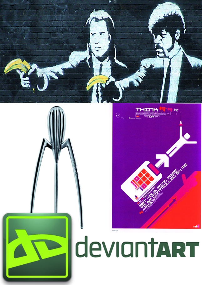
Next up is a creative who finds joy in the bold and the brave, in their words “My inspiration comes from the flow and form found in design. I admire structured design, especially corporate identity. My influences are: Designers Republic, Banksy, Phillippe Starck and the wonderful world that is deviantart”.

Dan

Our next entry is from someone who takes their inspiration from the wonderful world of media as a whole…”design to me is the colors and shapes used in graphic effects for tv, web and print”.

Kerry

The next entry has rather a lot of inspiration, they have listed them all here…”Sin City, 300 and graphic novel style art – not that awful manga sh*t. Coraline, Nightmare before Christmas, Morph and anything animated with models. Mexican Day of the dead celebrations and paraphernalia (am I sounding like a serial killer yet…?!).
Packaging. I’m an absolute sucker for great packaging design. Mobile phone boxes, the little hole in Maltesers boxes, Cadbury’s egg n spoon desserts, Mikado sticks… am guessing I should add food here… FOOOOOD!
The English countryside & the seasons. Photography and photo manipulation apps, take my phone everywhere and take pics of everything. And oooh I love a good sign as well…”.

Nicola

Our last entry draws their inspiration from both modern and vintage forms of artwork, their list includes Lucian Freud, vintage movie posters and books from the 1950’s and 1960’s, and the clean cut designs we find on the world wide web.

Chris

We hope you have enjoyed looking at our inspirations as much as we have enjoyed collating them!

How many did you guess right…?!

Love, the HL Studios Creative Team.

 
Leave a comment

Posted by on February 24, 2014 in design news


Tags: , , , , , , , , , , , , , , , , , , , ,

How to Illustrate 2 Simple, Popular Styles

How to Illustrate 2 Simple, Popular Styles

In this post there are two simple step-by-step tutorials of how to illustrate a cartoon style and a more realistic style…

Cartoon

Step 1 – Draw your sketch

cartoon_style

Have some fun with this, if you get what you want on paper the first time then great but don’t be afraid to experiment.

You can exaggerate features when drawing in this style, notice how the positioning of the features in the sketch are normal but I have played around with the sizing. The eyes are massive but the nose and mouth are tiny, the face shape itself is angular with a very pointy chin.

Step 2 – Start to ink your sketch in Illustrator

Once you are happy with your sketch, transfer it into Illustrator, you will want to put the image on a locked layer which is set to ‘template’ with a transparency of 50%. You can name this layer ‘sketch’ if you want.

Screen shot 2013-12-19 at 10.06.25

This now means you can ink your sketch clearly on a layer above this one.

I started by drawing out the outline of the hair, and then started adding in the features, jawline and neck, all using the pen tool.

Screen shot 2013-12-19 at 10.29.14

The tapered effect was achieved by altering the ‘profile’ of the pen stroke within the stroke palette.

Screen shot 2013-12-18 at 14.21.15

Step 3 – Colour

Create a third layer inbetween your sketch layer and inked line layer.

Transfer the shapes you created from the line layer in order to colour block your picture.

Screen shot 2013-12-19 at 10.46.33

You can also trace under the lines you created by locking the line layer, this is how I drew the whites of the eyes and the purple colours of the mouth.

Screen shot 2013-12-18 at 14.28.58

Step 4 – Adding details

cartoon style

You can see here that I have added gradients, shadows and highlights in order to make the artwork not look so ‘flat’, you can really be creative here and use your imagination in order to create your cartoon character! All of these extra details were added on the 3rd layer.

‘Realistic’ Style

Step 1 – Choose your picture

For this style you can either draw your face as in the previous tutorial or use a photo. As long as you have the rights to the photo I would suggest this option as the end result is usually better.

Screen shot 2013-12-18 at 14.50.04

Step 2 – Illustrator

As in the cartoon tutorial, place your photo on a locked template layer with a transparency of 50%.

Step 3 – Inking

For this style, we are going to be using coloured lines as they give a softer, more realistic effect. The black lines work for the cartoon style as they make the image stand out or ‘pop’ off of the page, with this style you need to consider the skin tones, shadows and light a little more.

Screen shot 2013-12-18 at 15.45.34

It is easier to ink the drawing using a bright colour so you can see what you’re drawing, in this case I have used red as it really stands out.

Step 4 – Colour

Once you are happy with your lines you can turn them the correct colour and also create a third layer for you to start the main colour up.

It is a very similar process to the first style, its just a case of creating an image that is as close (as you want) to the original photo as possible.

Screen shot 2013-12-18 at 15.55.44

Step 5 – Adding details

At this stage, you can add a lot of nice detail. Again I have used gradients, shadows, feathering, transparencies and also blends to get a good skin tone and feathered effect with the hair.

Realistic_StyleWe hope that this has been an interesting and useful read!

 
Leave a comment

Posted by on December 19, 2013 in illustration news


Tags: , , , , , , , , , , , , , , , ,

Image

HO! HO! HO!

Christmas_Card

 
Leave a comment

Posted by on December 19, 2013 in illustration news


Tags: , , , ,

Our 10 Best Illustrations of 2013

Presenting a list of the 10 illustrations we are most proud of from the past 12 months…

ScholasticAlice in Wonderland Smoking Caterpillar

Scholastic_Caterpillar

This is a fun artwork that was drawn for a series of books comissioned by Scholastic. It included many other characters from ‘Alice in Wonderland’ and also ‘The Lion, the Witch and the Wardrobe’, but this was by far our favourite!

RaintreeDinosaur Infographic

J8100_Animals_fig25_p28_29

When we first saw the brief for this infographic we initially thought ‘thats a lot of dino for one artwork!’, but they were so great to draw that when it was finished we ended up quite liking it, however busy it may look!

RaintreeDiagram of a Collision

Raintree_Diagram_of_a_Collision

This is an excellent example of some of the more technical artwork we create here at HL Studios. Another job from Raintree, this artwork shows an aerial view of a motorway collision.

RaintreeReduce, Reuse, Recycle

J8100_Environment_fig12_p12_13

An infographic from Raintree that represents the mantra ‘Reduce, Reuse, Recycle’ in quite a cartoony yet striking manner. We decided to feature this as it is a rather unusual style of artwork, and we’re always happy to show off the diverse range of styles the studio is able to produce.

RaintreeAnimal Abilities

Raintree_Animal_Abilites

Animals are great to draw, fact! We had lots of fun with this series of artworks, and this one is a particular favourite in the studio. It’s actually rather relaxing to draw animals (depending on how tight the schedule is of course!) and this artwork is a nice example of the range of different creatures we get the chance to illustrate.

Pearson OxfordBlack and White Villa

Pearson_Oxford_Black_and_White_Villa

This illustration has been chosen as it is a fantastic example of how an artwork can still be brought to life even if it is drawn using black and white. The perspective on the building is also very well done and therefore deserved a place in out 10 Best Blog.

Pearson Oxford ‘Church

church1

This is one of two artworks that were created for Pearson Oxford. It is a lovely example of how a simple cartoon style can still be used to portray a serious subject. There are some nice uses of shadowing, and the blends used for the brick work give a great perspective on the whole piece.

Pan MacmillanDanubia Map

Pan_Macmillan_Danubia_Map

We take a lot of pride in our cartography skills here at HL Studios, and this map in particular is an amazing example of what our illustrators can produce. The level of detail in this map is beautiful and absolutely deserved a place in this list.

MacmillanShanghai Waiter

Macmillan_Shanghai_Waiter

This piece is a collaboration between a few of our illustrators, it has been chosen for this list as it demonstrates how well the team works together whilst also showing off both techincal and figurative styles.

Cambridge University PressAnne Boleyn

CDU_RB2_u5_x3_i2

An artwork for CUP that was an absolute joy to illustrate. Again it is a straightforward style but capturing the likenesses of famous faces is always good fun to do.

We hope you have enjoyed this post, don’t forget to keep an eye out for more creativity from the illustration team in the future!

 
Leave a comment

Posted by on December 18, 2013 in design news, illustration news


Tags: , , , , , , , , , , , , , , , , , , ,

Welcome Autumn!

Autumn


Back to school, nights drawing in, wasps everywhere, busy busy time in publishing, ahhhh love it!

 
Leave a comment

Posted by on September 6, 2013 in design news


Tags: , , ,

Realistic 3D Paintings Of Aquatic Life

from The Graphic Design Blog.

Worth a follow for the fabulous examples of artwork that crop up from time to time.

This artist begins by painting the fish (using acrylics). He tries to use as little paint as possible, then pours resin into the bowl and continues to illustrate it layer by layer to create a sense of depth; thus creating the illusion of the fish swimming in water. I want the bucket of goldfish for my house, my cat would love them!

 
Realistic 3D Paintings 1
 
Realistic 3D Paintings 2
 
Realistic 3D Paintings 3
 
Realistic 3D Paintings 4
 
Realistic 3D Paintings 5
 
Realistic 3D Paintings 6
 
Realistic 3D Paintings 7
 
Realistic 3D Paintings 8
 
Realistic 3D Paintings 9
 
Realistic 3D Paintings 10
 
Realistic 3D Paintings 11
 
Realistic 3D Paintings 12
 
Realistic 3D Paintings 13
 
Realistic 3D Paintings 14

Click to follow them, or to follow us 😀

 
Leave a comment

Posted by on April 22, 2013 in illustration news


Tags: , , , , , , , , ,

How publishing for different devices impacts design

Guest blog courtesy of Christopher Bladon – Design Oracle, HL Studios for Bookmachine.

different-users-different-devices

Many design companies, like us here at HL Studios, come from a print or web-based background and have had to do some serious upgrading (of software, equipment and especially skills) to keep up with the multitude of digital devices available on the market today. Designing for these devices is quite complex, as each device has different characteristics that impact on the user experience.

Every digital project we undertake has different problems to overcome. In an ideal world we would start from a blank document and produce content for a single digital format, but as no single job is the same we frequently find ourselves dealing with legacy print documents that are required in multiple formats for multi-channel publishing. This situation is unlikely to change anytime soon and may never merge into a single universal standard.

Our starting point is always the format required – ePub, PDF, MOBI/PRC, AZW, IBA (iBooks Author) or stand-alone app. Usually the client dictates this, but in consultation one format may work better for the end user, especially if a more visually attractive media is needed. Thankfully, when multiple formats are required most layout software allows for the export of different formats, with the minimal of changes to any files. IBooks Author is slightly different. At the moment there is no direct way of importing InDesign or Quark files into the program – there are some work-arounds to this, but none of which are entirely satisfactory, as yet. We are working with our programmers to create an InDesign plug-in that can export directly to iBooks – which we hope will make the process of conversion smoother.

The next important thing to think about is the orientation – Landscape or Portrait, Fixed or Fluid – this may have implications on the construction of the document. Re-flowable and re-sizeable text aside, an ePub file has the issue of what to do with design features such as chapter headings and chapter openers. In a print-first workflow where the design features have been commissioned with the printed book in mind, there is an inevitable conflict between preserving the ‘look’ of the book and retaining the usability of the e-book.

Another good practice is to ensure the correct usage of stylesheets. Tags and stylesheets enable efficient single source, multi-channel publishing. And the most effective technology for employing tags and stylesheets is xml. Using an xml workflow or book production smoothes the transition from print to digital.

Size becomes an issue (don’t laugh) if you pack an e-book full of all the exciting interactive features available. Most digital marketplaces have strict guidelines on the maximum size allowed for each document.

There are many other things to take in to account, for instance black backgrounds enhance glare on most devices and font choices become irrelevant when using formats like ePub. We also need to design with the finger in mind. An adult finger is larger, but a young child’s finger is less accurate, so it’s important to ensure that any design works for all potential users. Links need to be large enough to click. Allowing for the navigation features on each device is important, for instance, the iPAD has a pop-up navigation bar at the top (44px) and a toolbar at the bottom (40px); any clickable feature in an e-book needs to be clear of this area. Other devices have similar navigation bars that need to be designed around. We have found that leaving an area of about 50px around all sides usually covers most tablets or smartphones.

The initial construction of a print document has the greatest impact on the conversion into an e-book, so good practice in a workflow is essential. If you would like tips on how to do this successfully, feel free to contact us at HL Studios, be it just for an informal chat or to arrange a full professional presentation.

 
1 Comment

Posted by on February 21, 2013 in design news


Tags: , , , , , , , , , , ,

Image

‘Hello’

bookmachine.indd

 
Leave a comment

Posted by on February 7, 2013 in design news, illustration news


Tags: , , , , , ,

Work Experience

A quick shout out to our brilliant work experience boy Matthew Kinahan who (reluctantly) went back to school today. We miss you Matt!

matt

Matthew contacted HL Studios back in March to request a work experience placement with us as he was a local lad with a keen interest in animation. We emailed him back explaining that this is not something we have offered before and that we were worried we might not be able to give him much to do and he may get bored. The response we got from him impressed us so much that we offered it to him without a second thought:

“I would be quite happy to make tea all week
I don’t necessarily want hands on experience and just to see people working would be great, I have my own laptop and drawing tablet so I could try animating using some of the techniques you use.
I would be no bother and would be quite happy to do odd jobs and errands as well.”

True to his word he was no bother at all. We gave him an illustration to draw and then talked him through animating it. He then went on to make his own animation based on what he had learned – which was ace!

He was an absolute delight to have about the place and his youthful enthusiasm and polite, confident manner gave us new hope for the next generation! He even brought in biscuits on the last day!

Best of luck for the future Matt, we know you will do well in whatever career you chose.

PS: apologies for stealing your photo!

 
Leave a comment

Posted by on December 3, 2012 in illustration news


Tags: , , , , ,

Why choose HL Studios?

As a creative design company HL Studios has established a name for itself by delivering solutions that really work. We provide quality design that gets the message across and brings real-life innovative results.

Aren’t all graphic designers the same?

We don’t think so, and in fact we genuinely believe that we are different from other companies offering similar services and here’s why:

We have established ourselves in our sector and now provide our many services to a range of clients throughout the UK and beyond. You can be assured that when you deal with us you will get great value, high quality work and outstanding service.

Indeed, client satisfaction is very important to us, as is our focus on helping clients meet their objectives and needs. Whether creating a new corporate brand or designing a book layout, we have the solutions.

Our studio philosophy is simple.

We produce great work and we achieve results by listening to what our clients want and then we deliver it to them. We have all the capabilities and experience you’d expect, but we don’t have the hierarchy of account management that often leads to slow response times and confused briefs.

You get direct access to the design team doing the work, meaning that working with us is a truly hands-on experience. Be that over the phone, site visits or simply popping in for a cup of tea. We are approachable, upfront and honest, have a real ‘can do’ attitude and a never ending supply of biscuits.

We are always looking for fresh new challenges. So scan the code, visit the website or simply pick up the phone and chat to one of our friendly peeps today…

 
Leave a comment

Posted by on November 15, 2012 in design news, illustration news


Tags: , , , , , , , ,